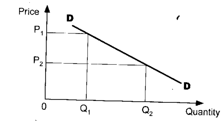
Demand curve
It is a graphical representation of the demand schedule. The quantities of a commodity that would he bought at various prices can be represented in a graphical form - the demand curve. The demand curve shows the relationship between quantity demanded of a good and its price. It is drawn on the assumption that quantity demanded depends on the price of the commodity, other things being constant (ceteris paribus).
Other things that remain constant could be income, taste, price of other goods, etc. Price is represented on the vertical axis while quantity demanded is on the horizontal axis. A typical demand curve is downward sloping from left to right. At a higher price OP1, a small
amount of OQ2, is demanded while at a lower price of OP2, more
quantity of OQ2 is demanded.
amount of OQ2, is demanded while at a lower price of OP2, more
quantity of OQ2 is demanded.

Demand curve: quantity demanded depends on price other things
remaining constant.
remaining constant.
It should be noted that the market demand curve is more elastic than
the individual demand curve (Figure 2.3). For the same price OP-|, the quantity demanded in the market is OQ7 [i.e. Oq-, + Oq3+ Oq5j which is much bigger than the individual quantities for either consumer A or B or C. Similarly at price OP2, the quantity demanded in the market is OQ8 (Oq2 + Oq4 + Oq6) which is larger than the individual quantities for either consumer A or B or C.
Figure 2. 3 Individual and market demand curves.
